When visiting the cinemas, Users have to arrive ahead of time, queue and then finally choose a seat.This is time-consuming and stressful and the possibility of groups sitting side by side becomes slimmer depending on the arrival time to the viewing room.
Oct,2021 to March,2022
UX Designer
User research, paper and digital wireframing, Low-fidelity and
high-fidelity Prototyping, usability studies, accounting for
accessibility,
iterating on design
Figma

Miro
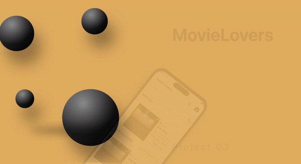
MovieLovers is an app an easy and fast way to allow online ticketing and seat reservations ahead of cinema time. primary users are Nigerians between the age of 18 -60.
Getting Started
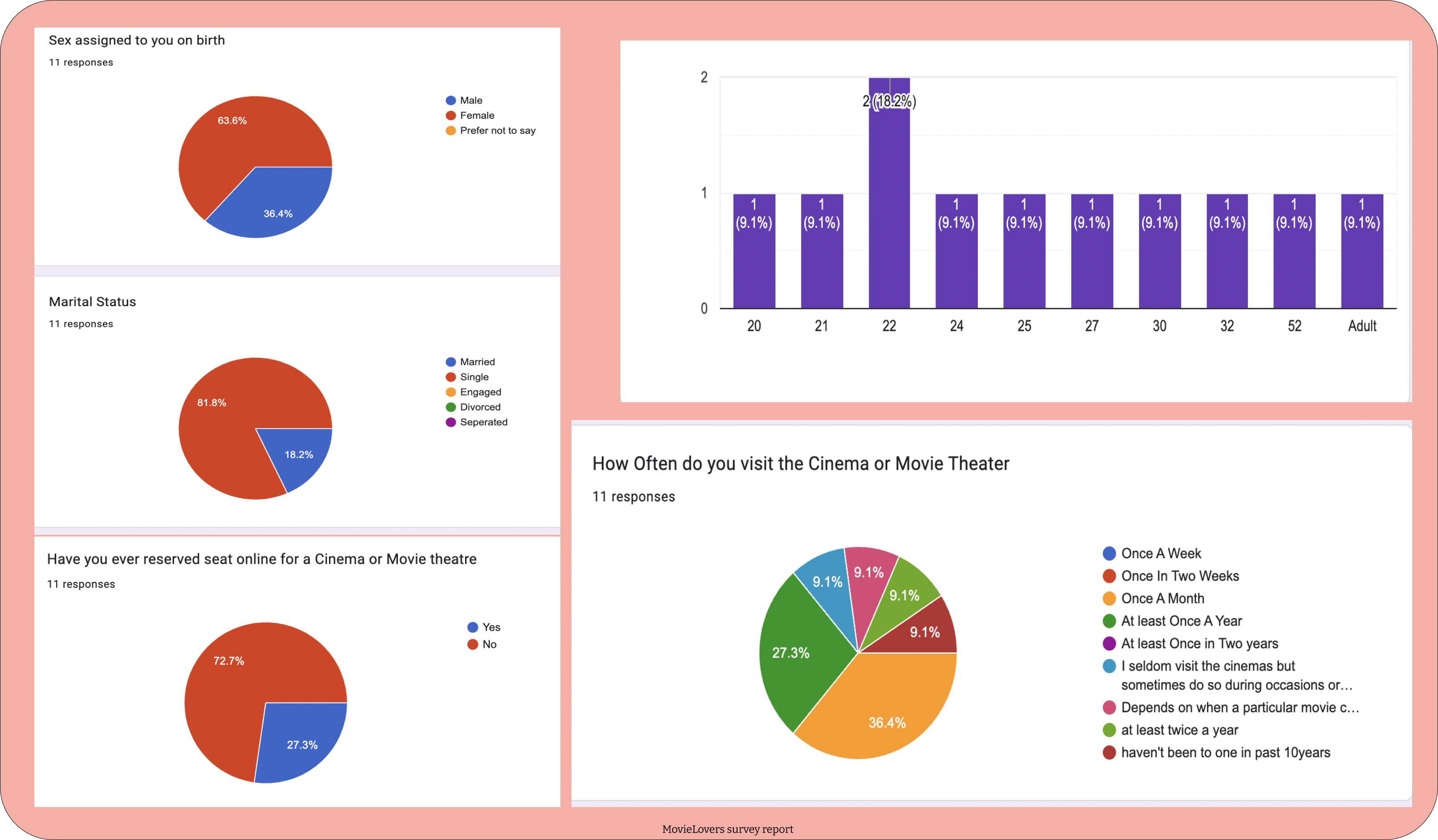
I started by defining our audience.After which I conducted surverys on fifteen (15) candidates and a remote interview on 3 Candidates.
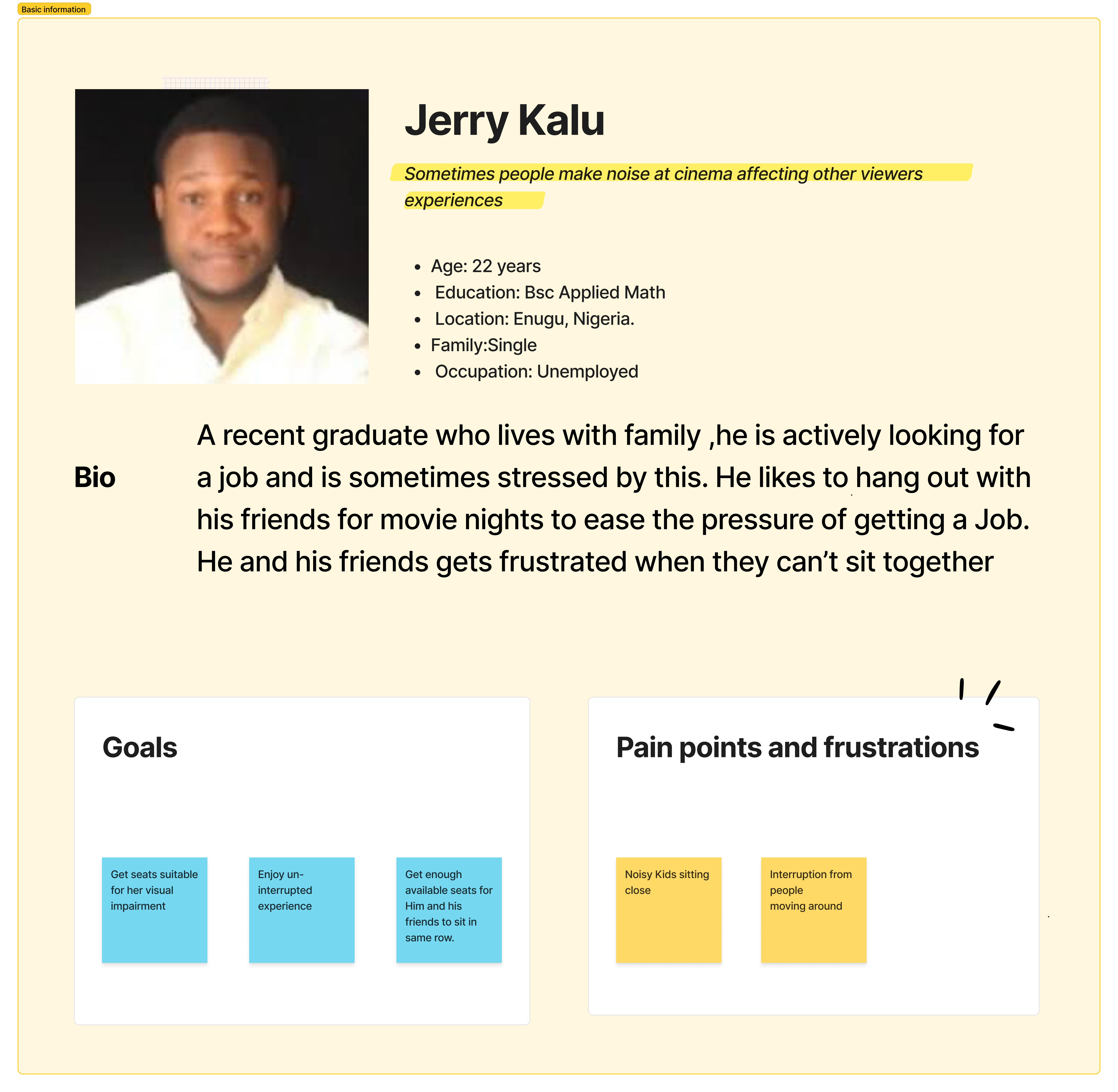
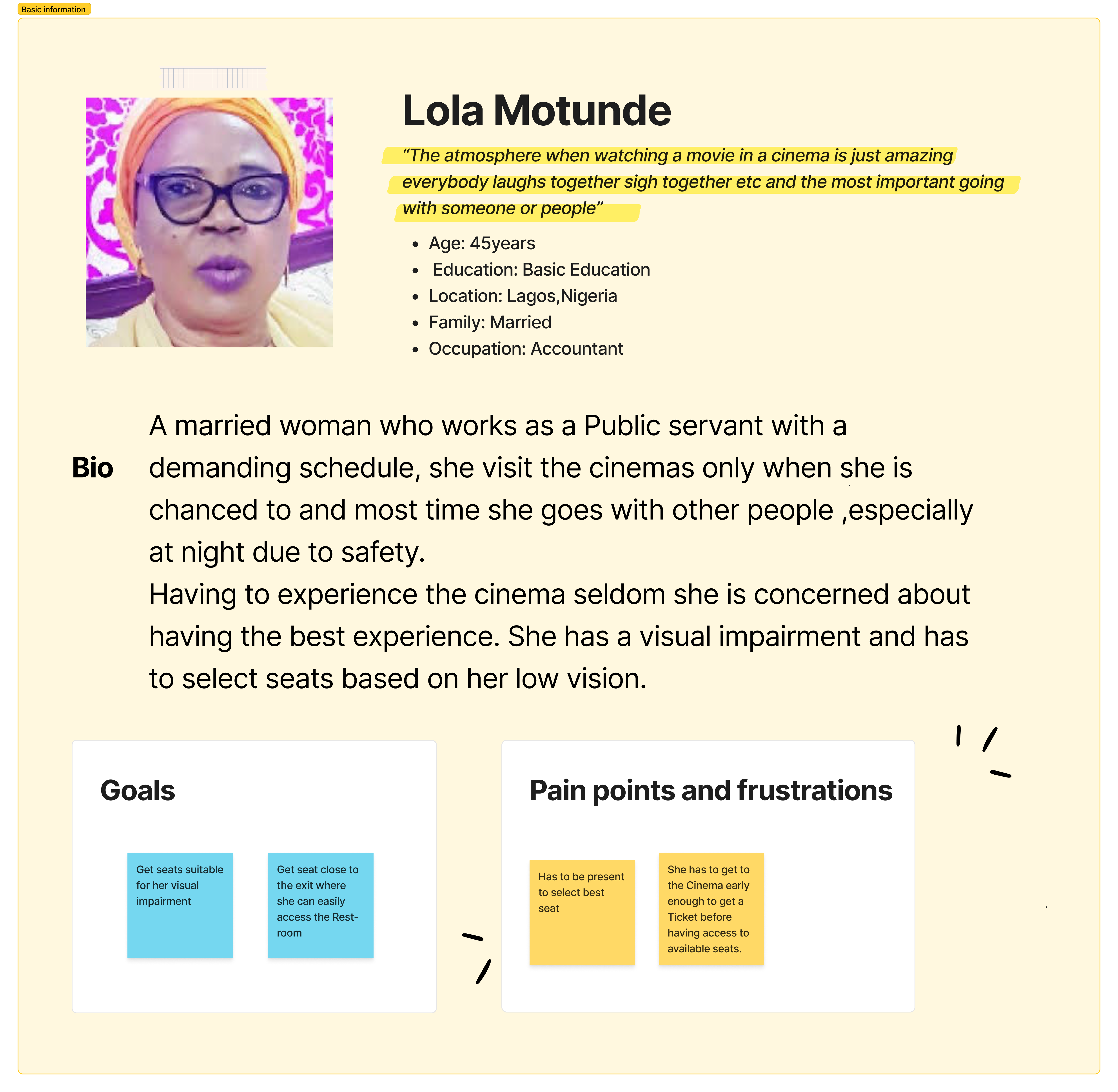
Based on the result gathered, I was able to highlight the pain points of potential Users.
Carrying Out The Research
Upon conducting research, I discovered that most users have never reserved a seat ahead at the cinema and users hanging out in groups have difficulty sitting side by side and are scattered around the cinema.
Gathering Research Findings
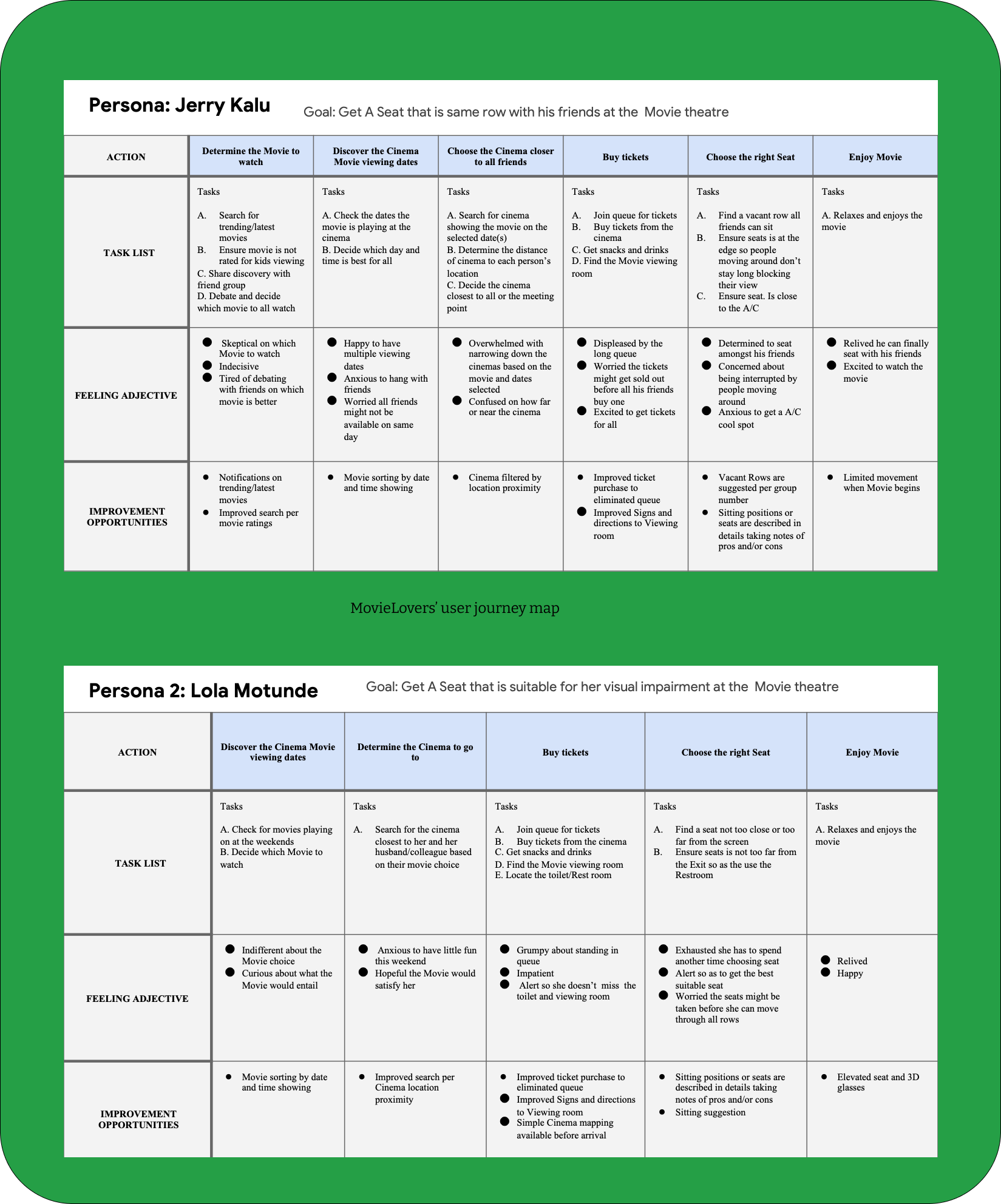
Understanding the typical flow users take from point of entry in the Cinema till they choose their seats in the Movie rooms helps foster room for improvements as we see things through the lens of the Users.
User Journey Mapping
User Story
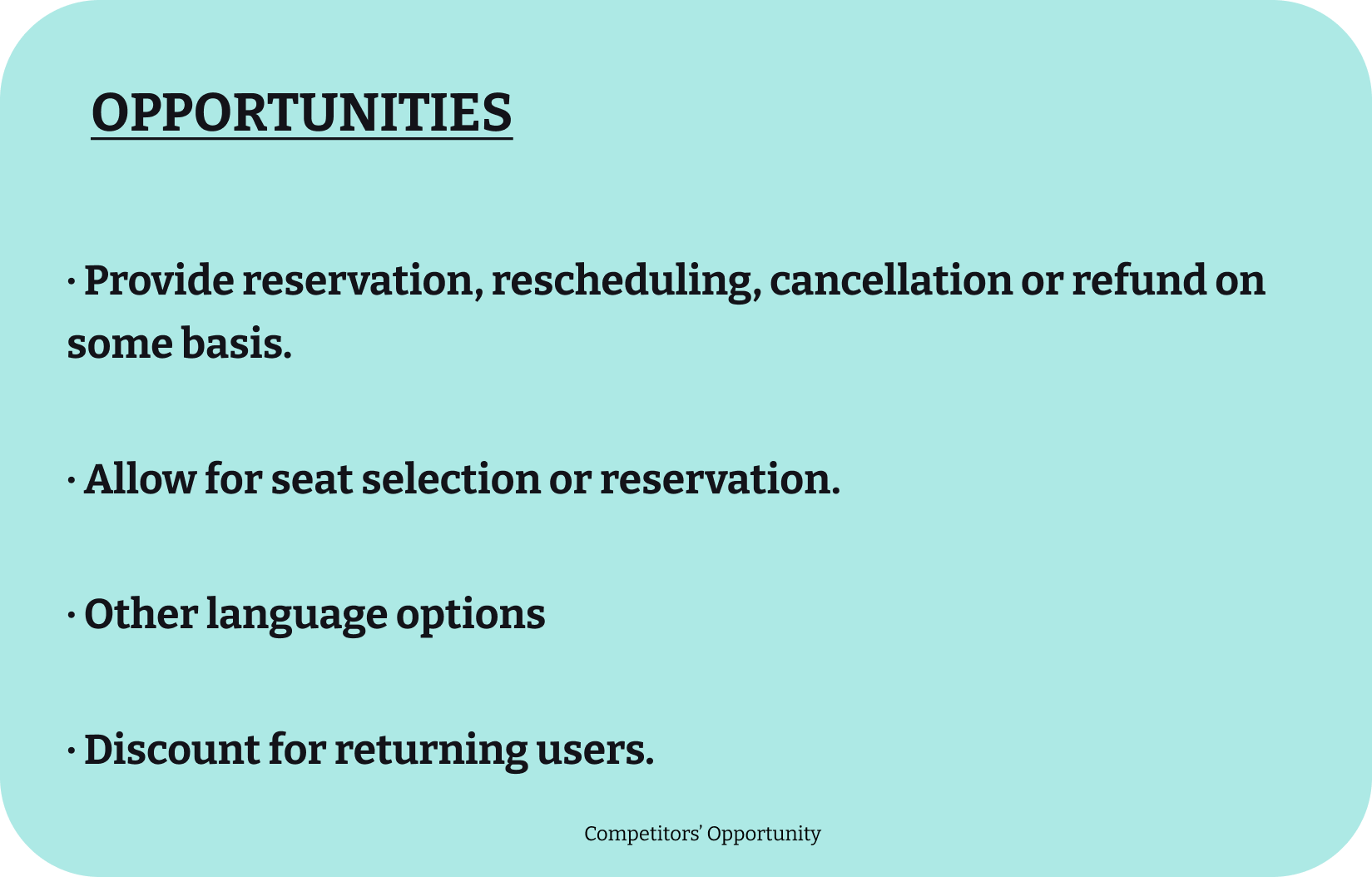
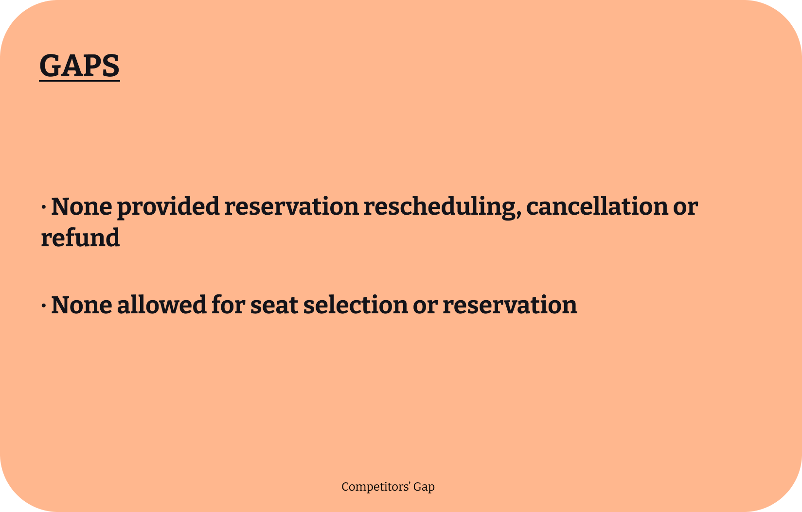
Analysing Research Findings
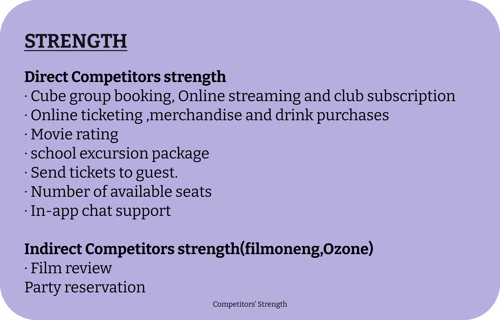
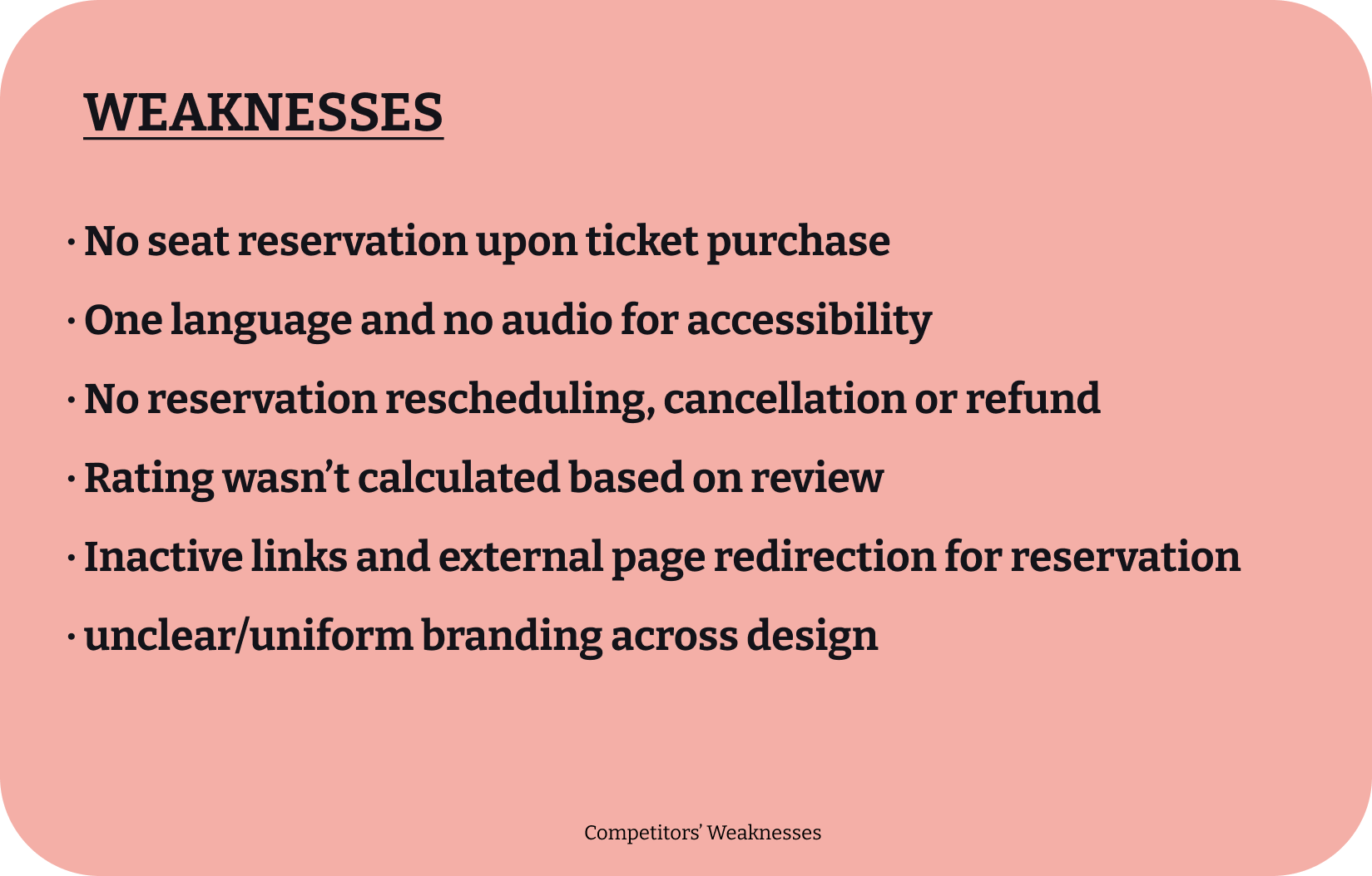
By discovering the strength and weaknesses of my competitors I was able to highlight my Unique Value proposition.
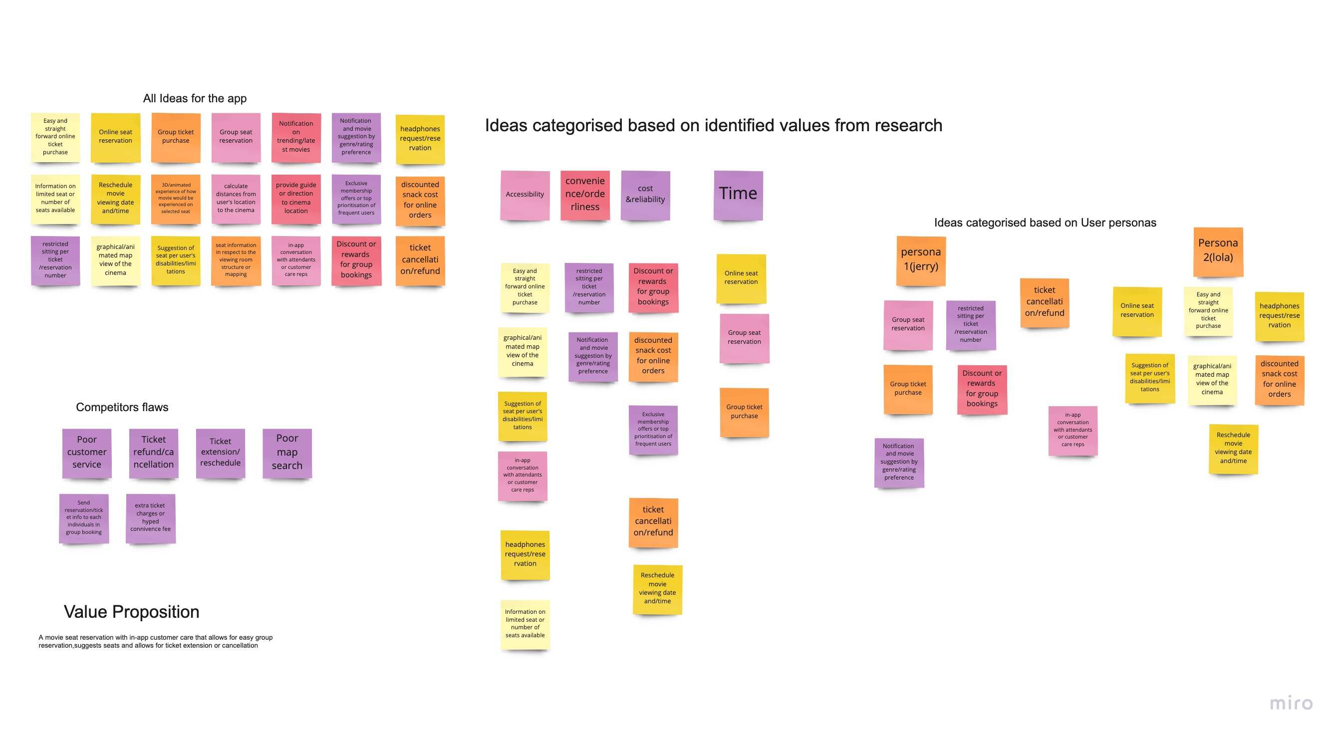
Information Architecture
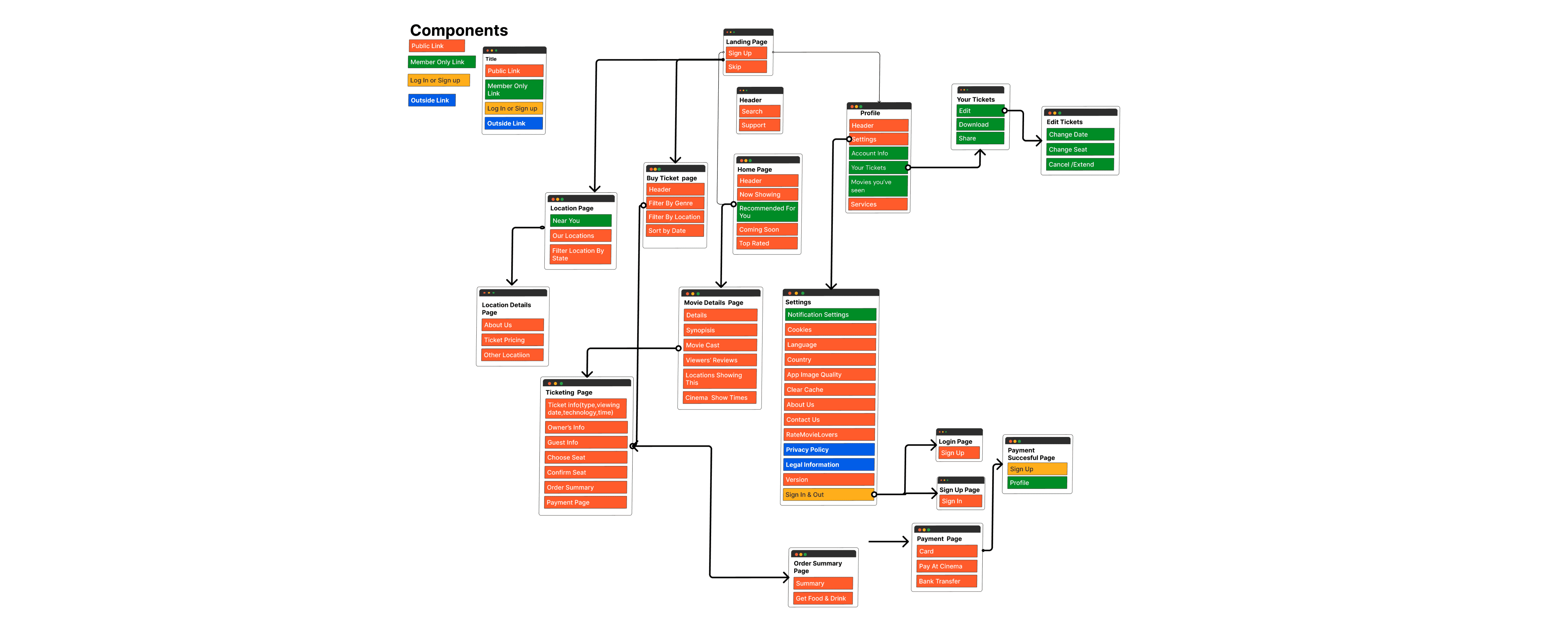
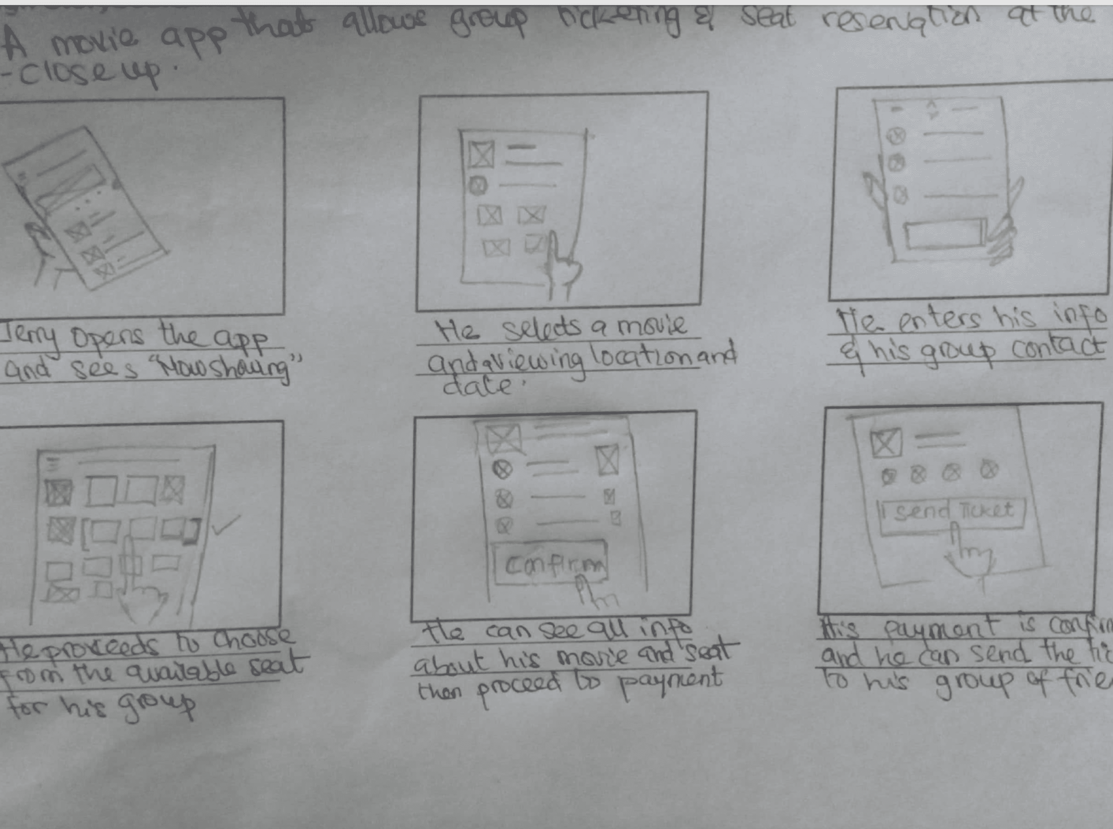
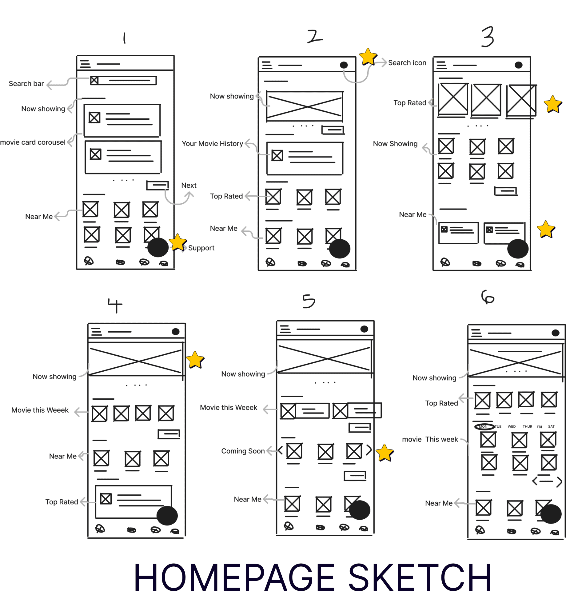
I wanted Users to easily start the Ticketing and seat flow at different point of the website and by starting out with a paper sketch I was able to easily draw out the flow in order to improve the user journey highlighted in the User Jorney map.
Design
was able to doodle multiple designs for major pages like the homepage and then I selected sections I wanted to keep and combined them in my sixth sketch.This makes it easy for me to draft solutions saving costs and also reducing the personal bias that can develop from building digitally
Design
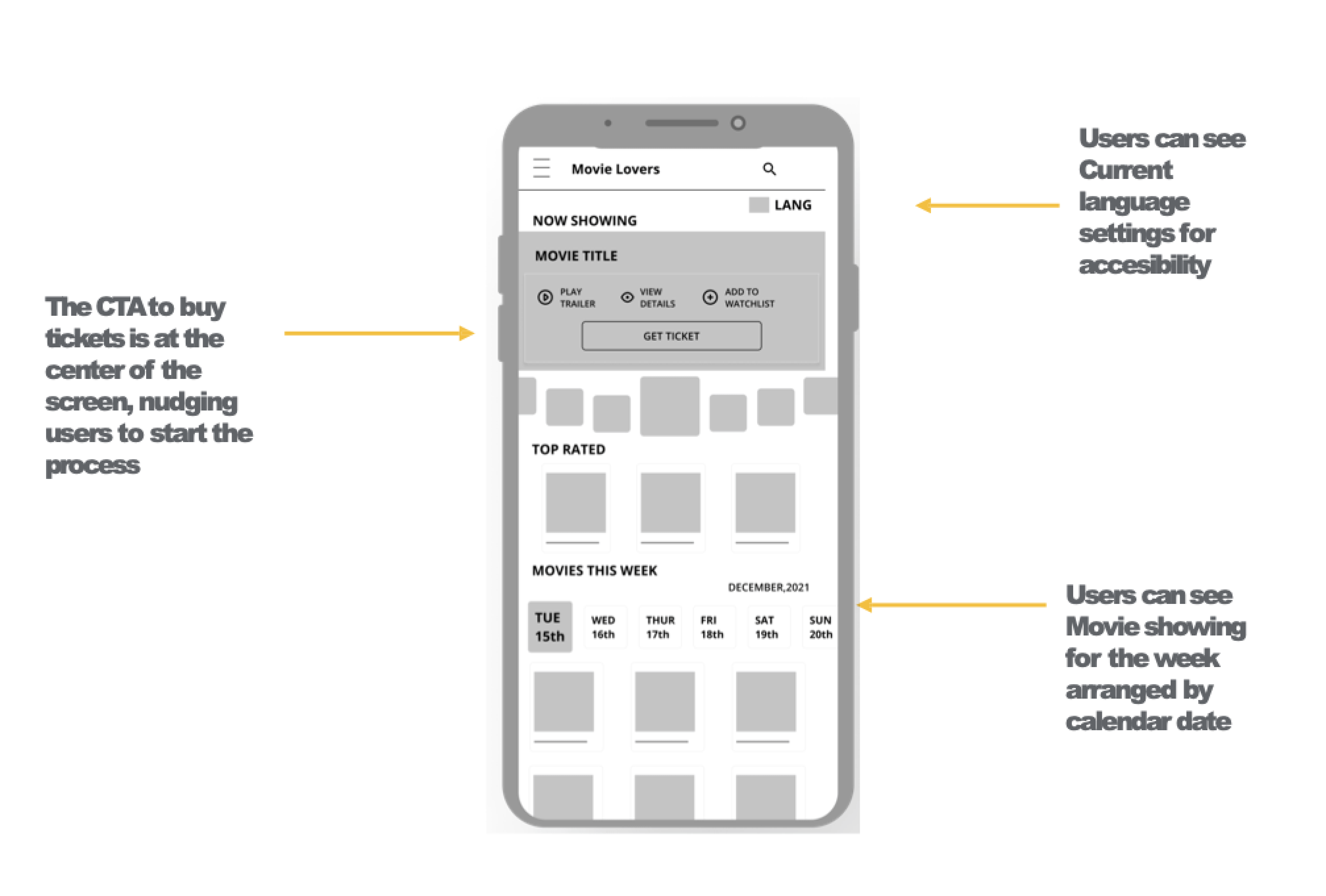 The Homepage was designed to keep users excited by containing lots of movie media and prompt to purchase ticket(s)
The seat section was designed to provide an engaging representation of the seats in the cinema hall .
The Homepage was designed to keep users excited by containing lots of movie media and prompt to purchase ticket(s)
The seat section was designed to provide an engaging representation of the seats in the cinema hall .
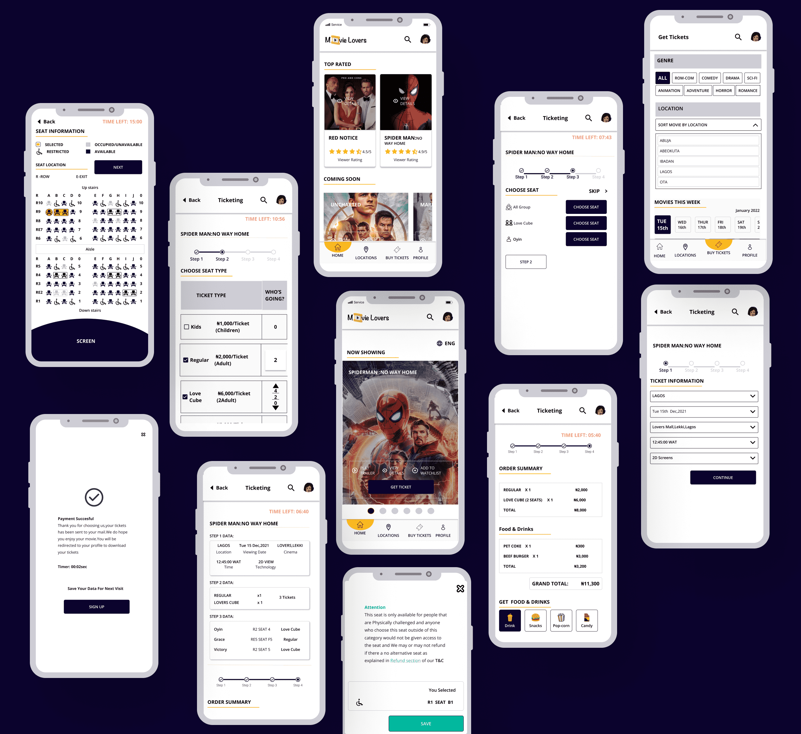
Prototype
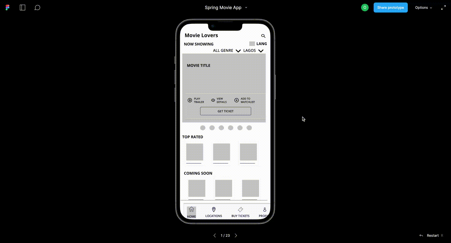
To ensure users could easily perform the task of reserving seat, the screen was connected and now it's time to test.
Test
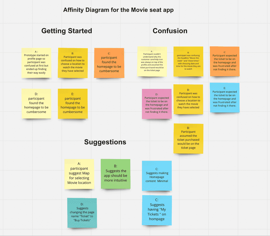
I conducted an unmoderated usability test on five(5) participant meeting our target audience criteria in order to ensure users can achieve core goals seamlessly and understand their overall experience. The following insights were gathered:
Each participant were asked to perform different tasks based on the research goals some of which are: How easy/difficult was the task to complete and the time on task.
Below are the findings from the research:
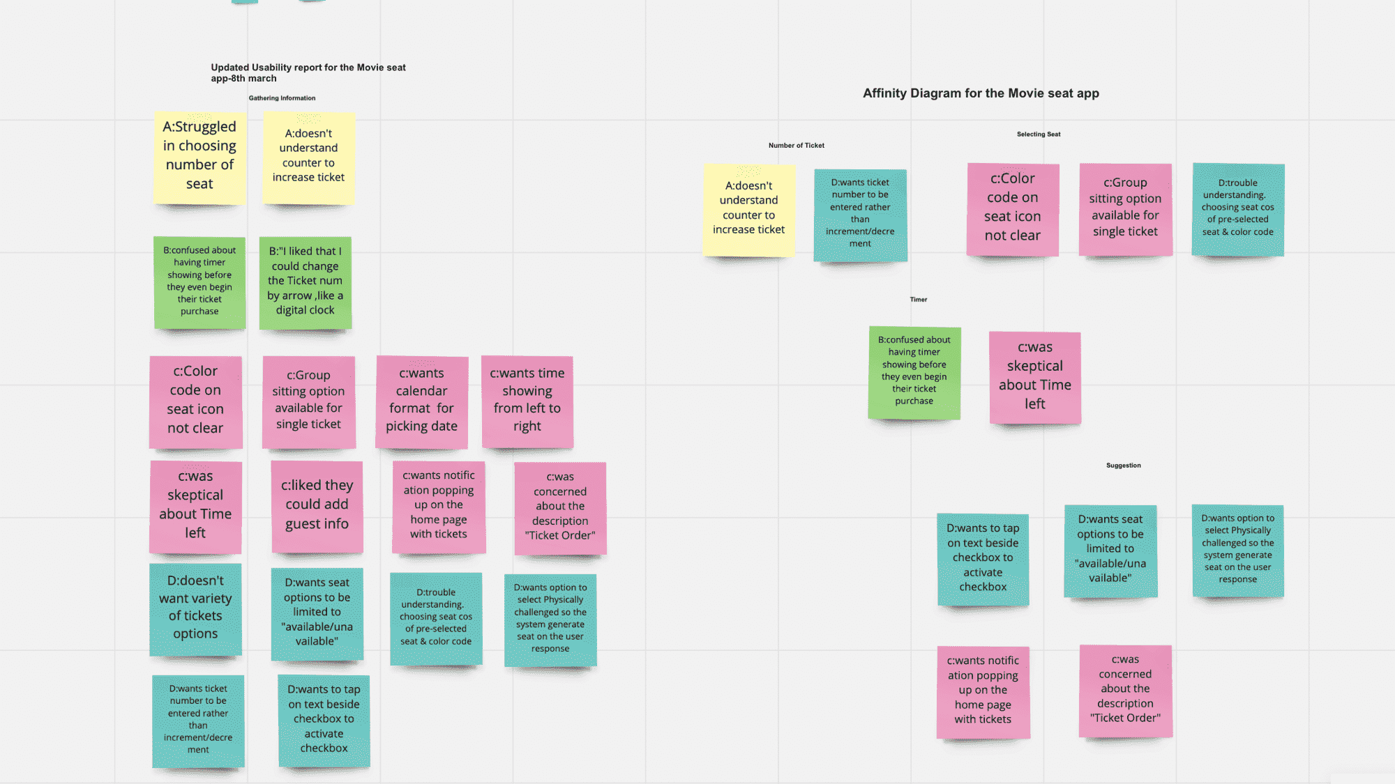
Refining
Below are some key notes showing how the design was improved based on feedback :
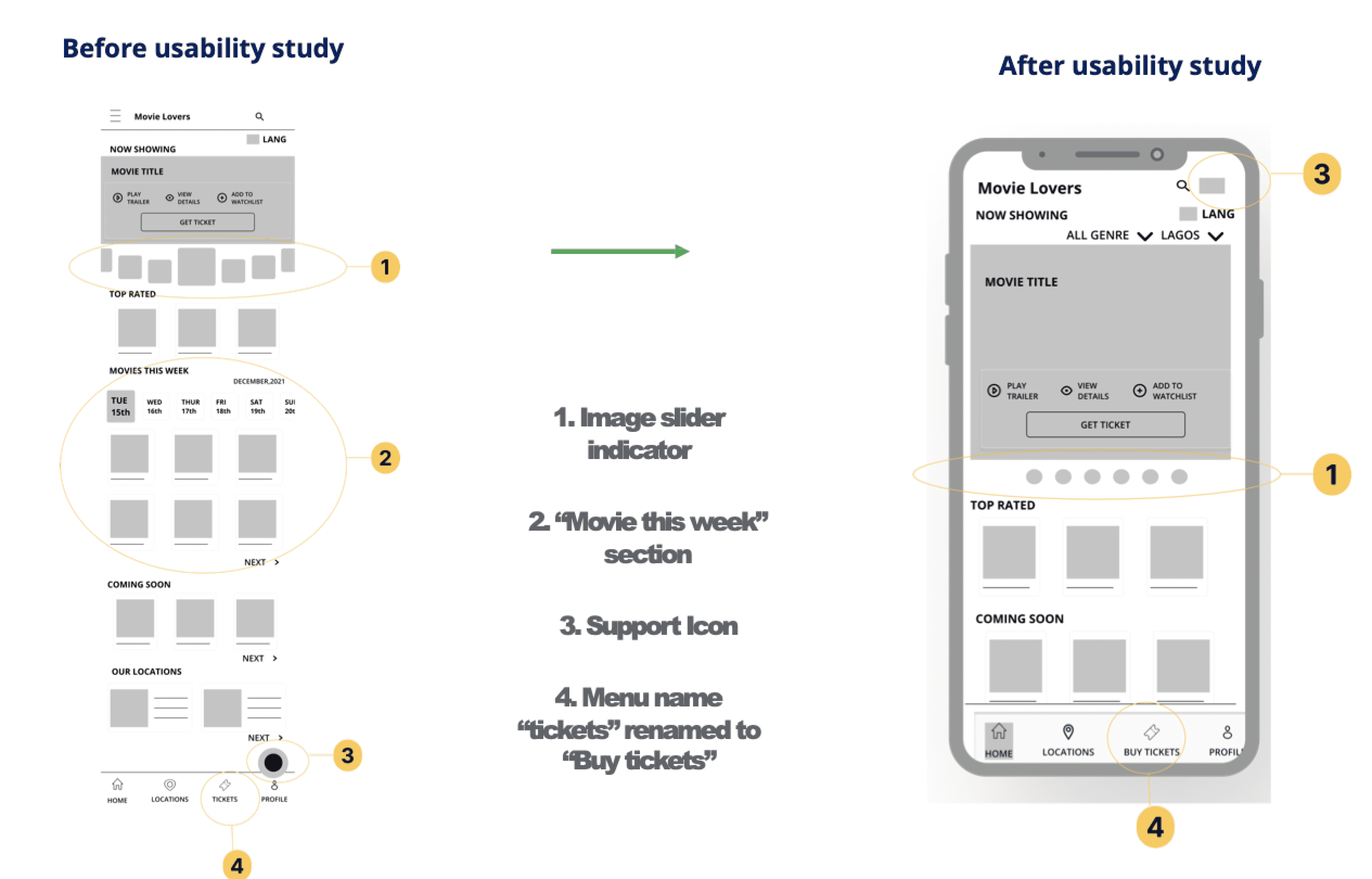
Before Usability studies, the Home page contained so many sections and image slider indicators making the page crowded. Users assume the menu named“Ticket” was where their purchased ticket was and this had to be renamed to “Buy ticket”
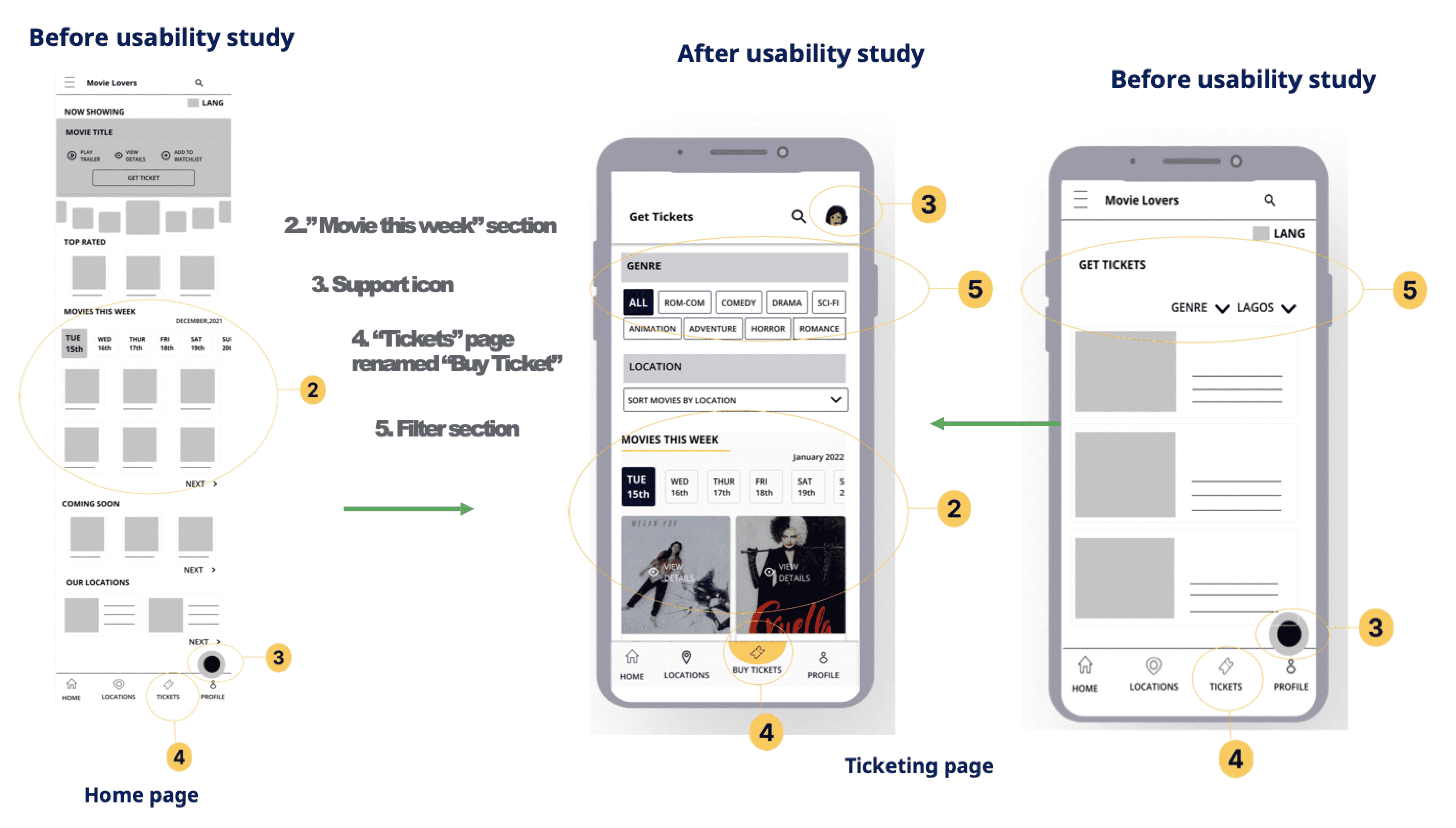
After Usability test the section “Movies this Week” from the home page was moved to “Buy tickets” and users had better filters and search function, which allowed them to focus solely on choosing movie per Show dates

The seat selection page didn’t have clear colour coding to tell sitting information apart, with this the colour coding was adjusted on the seat icons and icons and text,” Restricted” was used to help differentiate restricted sitting from unavailable seats
Before the usability test, the user had to scroll to view information about their selected seats. This was improved with a pop-up modal giving more information about the seat. Initially when the user tapped on the seat icon the modal showed that they could save and move to the next page, but this wasn’t effective for group sitting and didn’t reflect the seat colour code since both actions were initiated by tap. This was fixed with a “next” button disabled till the user makes a selection and the modal initiated when the“next” button is selected
Design
Prototype
Take Away
The app enables users to reserve seats in a group and gives users the ability to choose what is best for them and allows fixes for mistakes
" Gave me options to add other names and emails which is great"
" I liked that I could change the Ticket number by the arrow ,like a digital clock"
Take Away
II learned how much a usability test can impact a design and get rid of bias
project 01
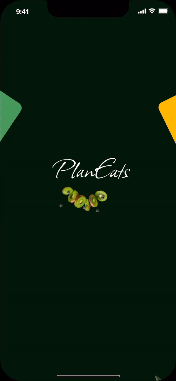
PlanEats is an app focused on providing healthier food options, which includes providing people with better food choices, the skills to cook healthier food, or the knowledge to make healthier food choices.The primary users are Nigerians between the age of 20 and 60 mainly in control of their food
View Projectproject 02
A blogging site
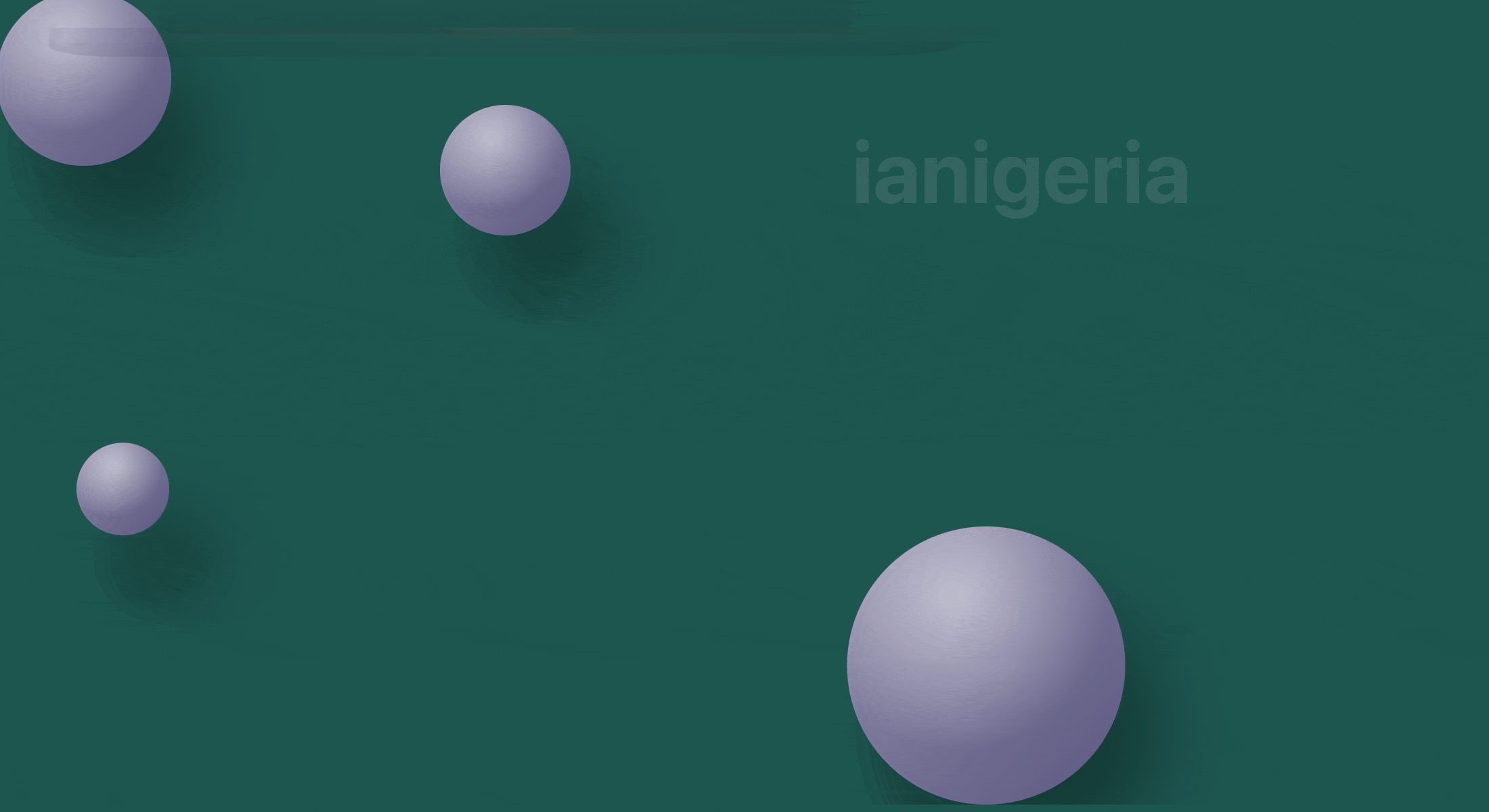
With a need to convey the vivid spectrum of Nigerian lifestyles to the world, iaNigeria aims to holistically capture the essence of the Nigerian experience.Sharing the culture, lifestyle and stories that showcases Nigeria to the world.
View Project